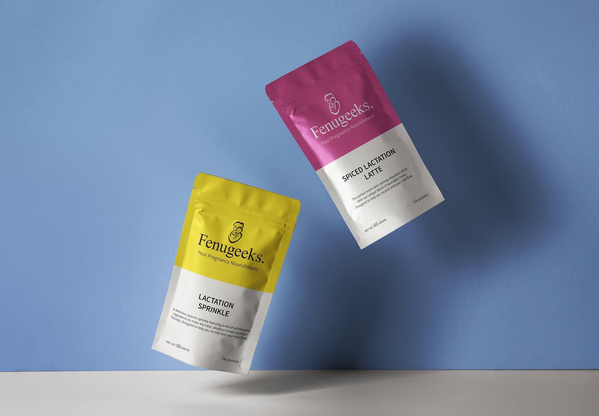
Brand Identity
The branding had to be strong to give this new company standout with their products yet also evoke warmth to appeal to new mothers. I started with using a Serif font. An elegant yet sophisticated typeface to demonstrate the gentle care and unbreakable bond between mother and baby.
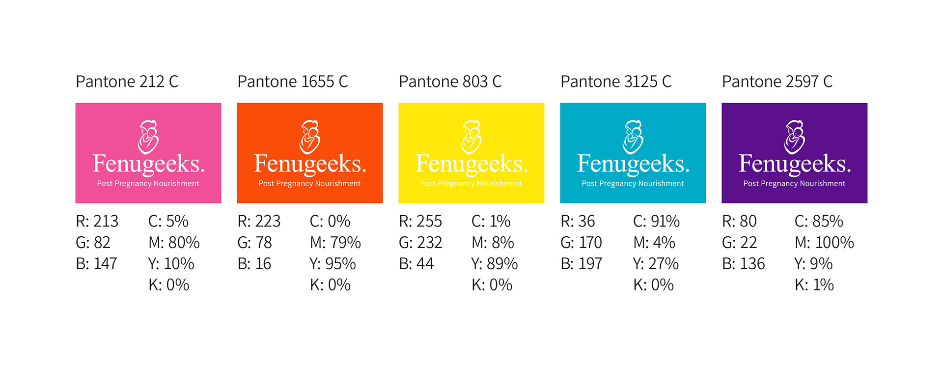
Colour Scheme
Accent colours draw attention and differentiate product ranges but also create eye catching shelf appeal.
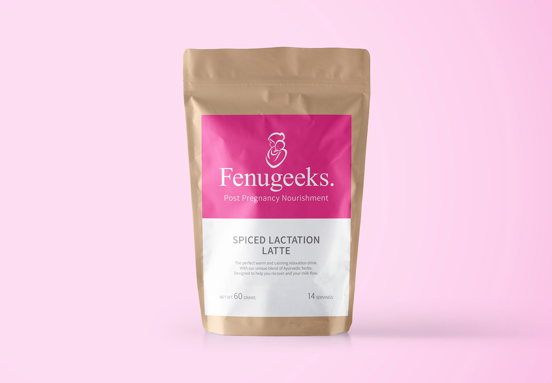
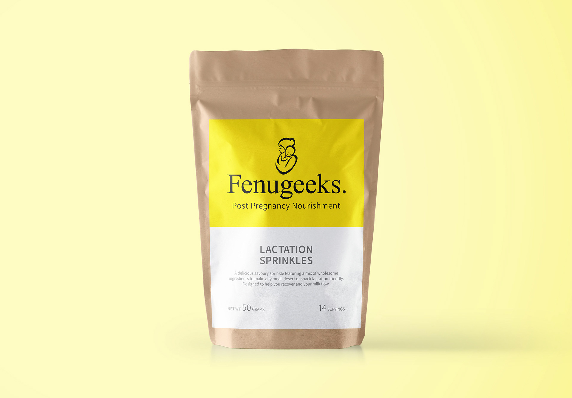
Pack design
As Fenugeeks is a start up company the idea was to create cost effective labels which could evolve as the company grew. I created designs for sustainable eco-friendly packaging to build on the company's natural and organic ethos.
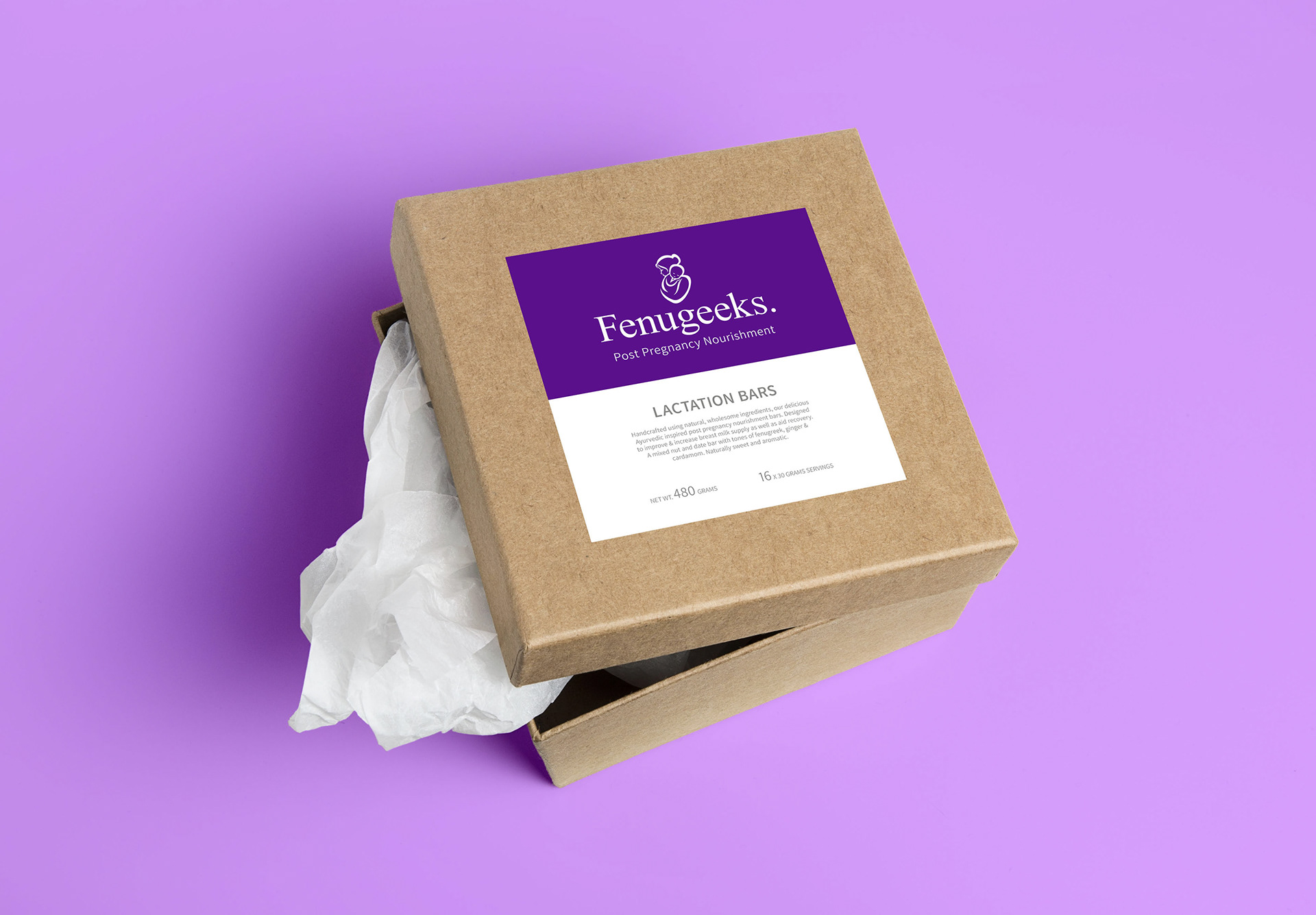
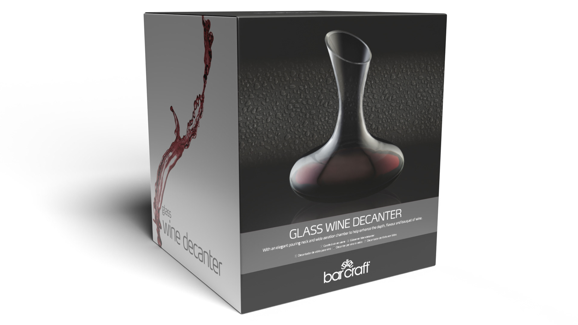
Premium concept
I provided concepts of what the packaging could look like using more premium materials yet still thriving to be sustainable with eco-friendly packaging. This is a future vision of the product.