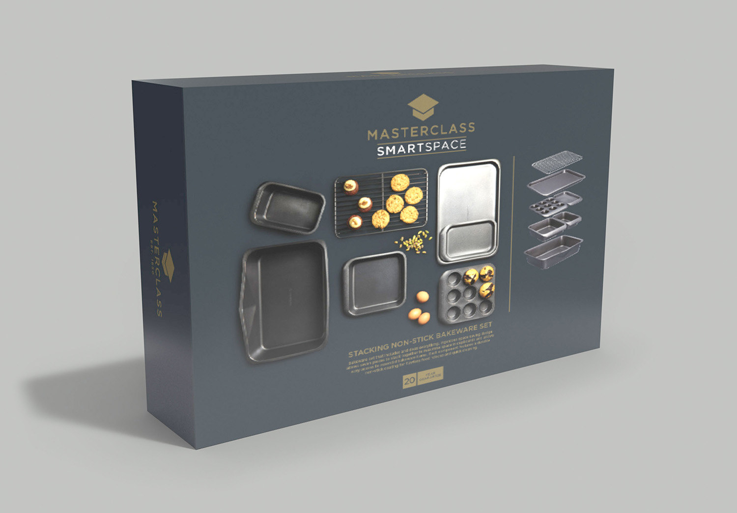
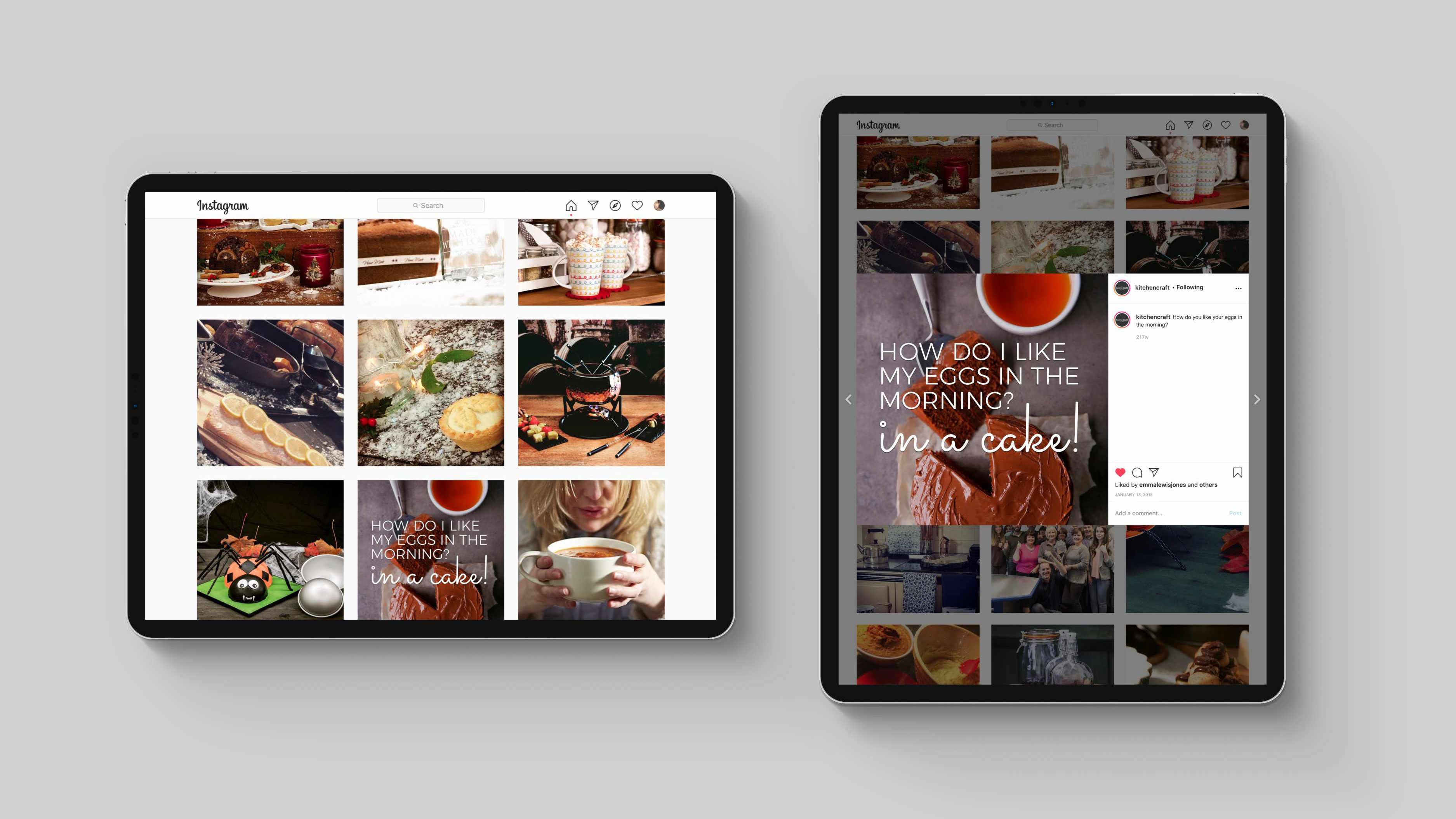
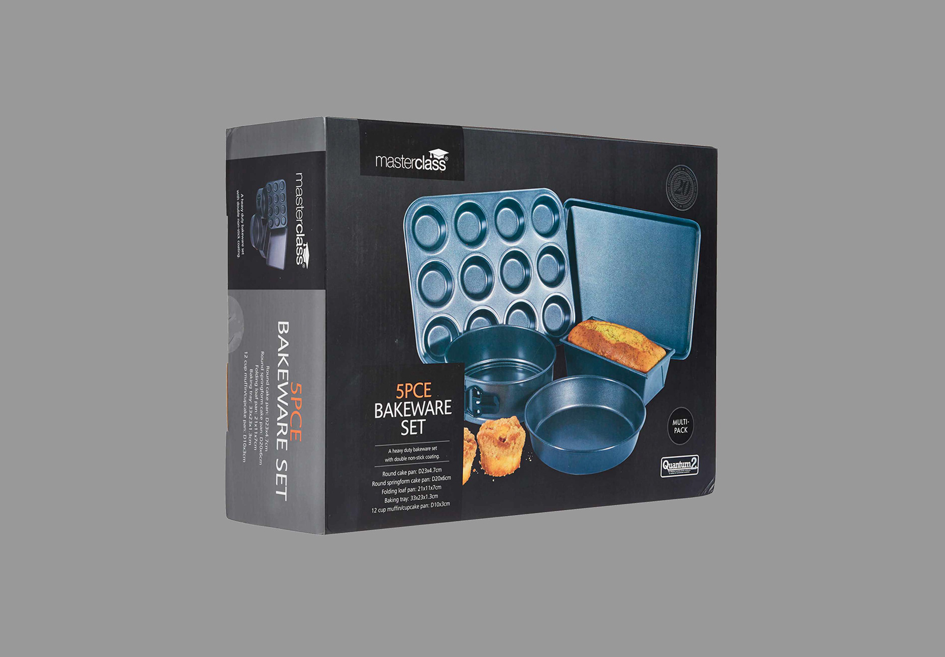
A household favourite
Masterclass became a household premium brand and had served consumers very well for decades. Its strong durable products built a trust with consumers and was the go to brand for all cookware items. But over the years the brand started to look dated as new competitors appeared on the market.

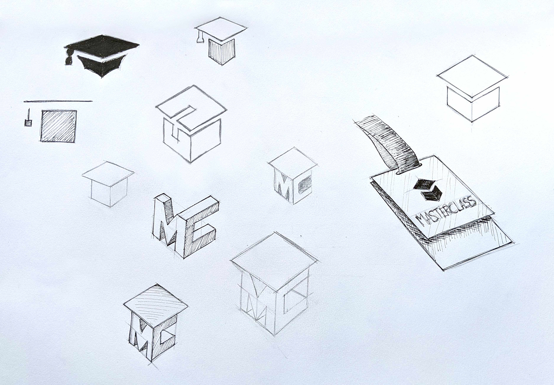
Sketches
I knew that Masterclass was a very trusted brand and to create a complete revamp was out of the question as it could have alienated customers. Instead, what it needed was a very subtle update to bring it forward to the present day, yet keeping its strong heritage.
Evolution of the Master
As the logo developed with its straight angled lines and sharp points, Masterclass was starting to look and feel more solid and grown-up.


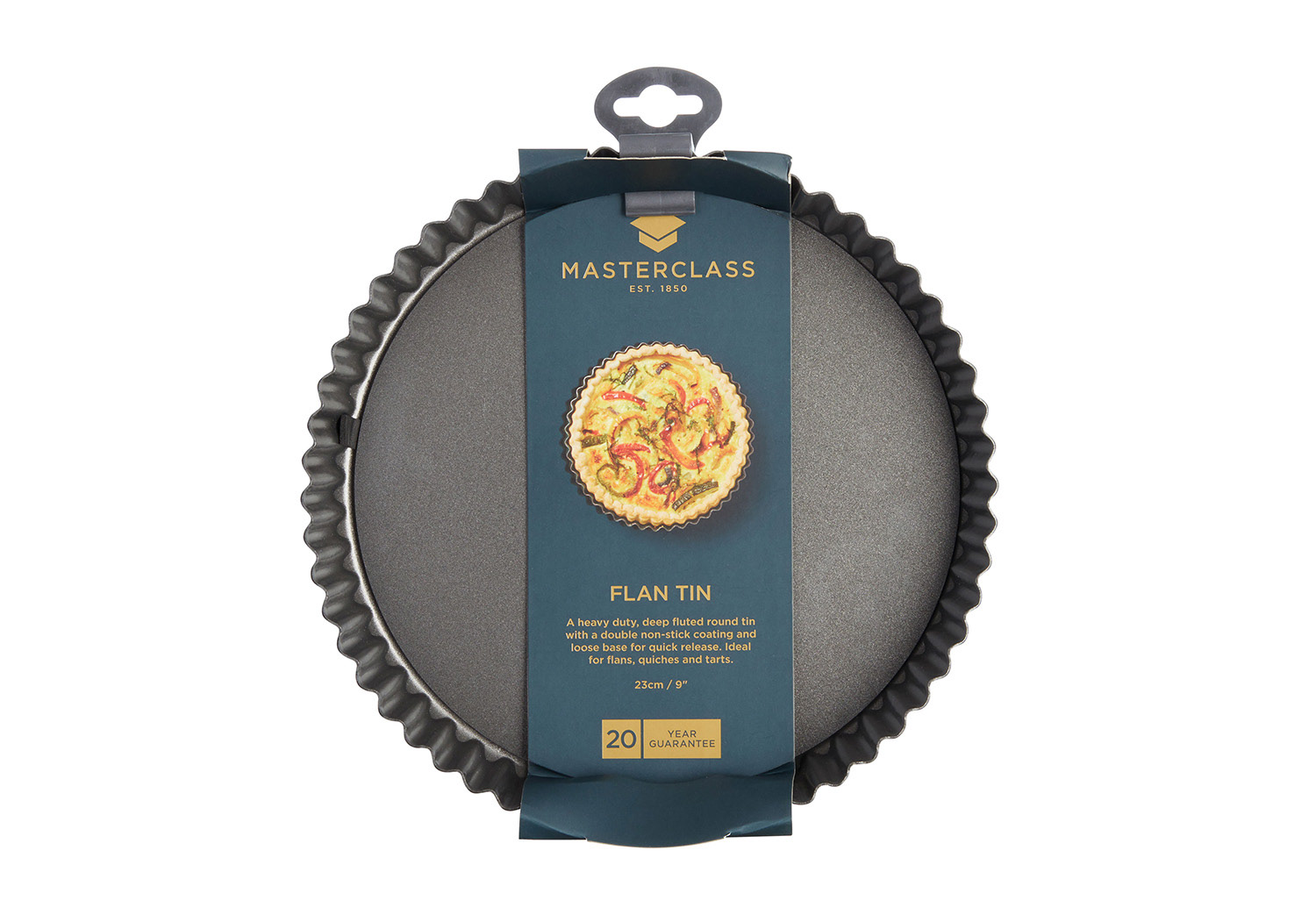
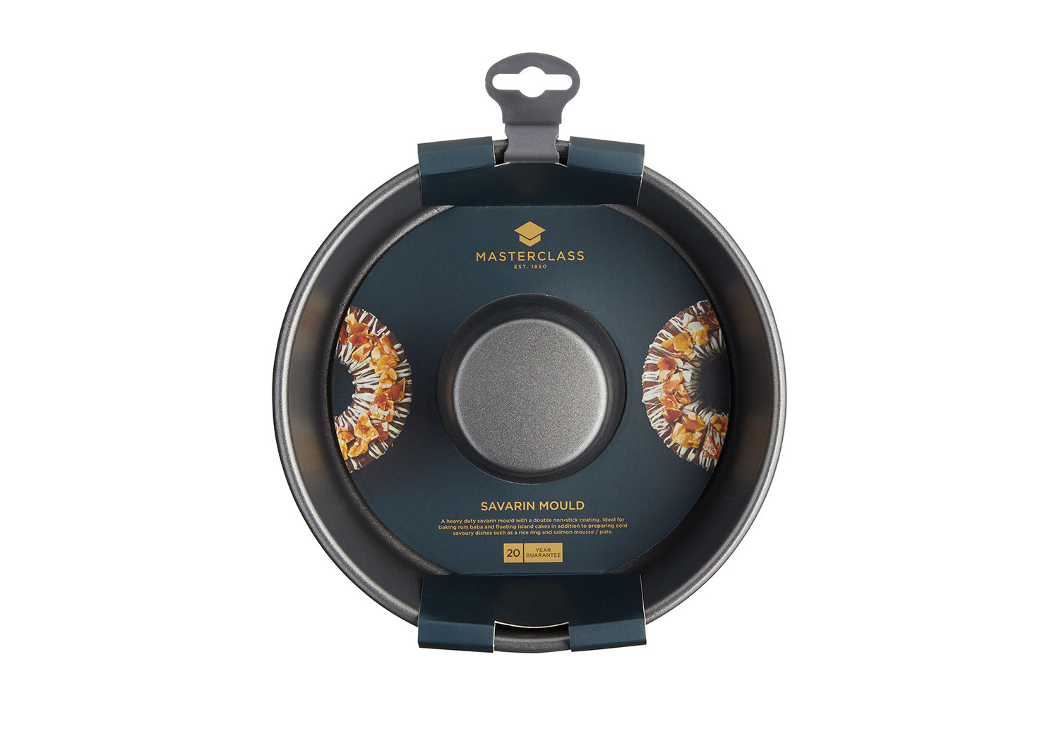
Brand Identity
I identified the key elements to ensure the brand is built correctly to create a consistant look across all media. This included primary and secondary logos which could be scaled proportionally.
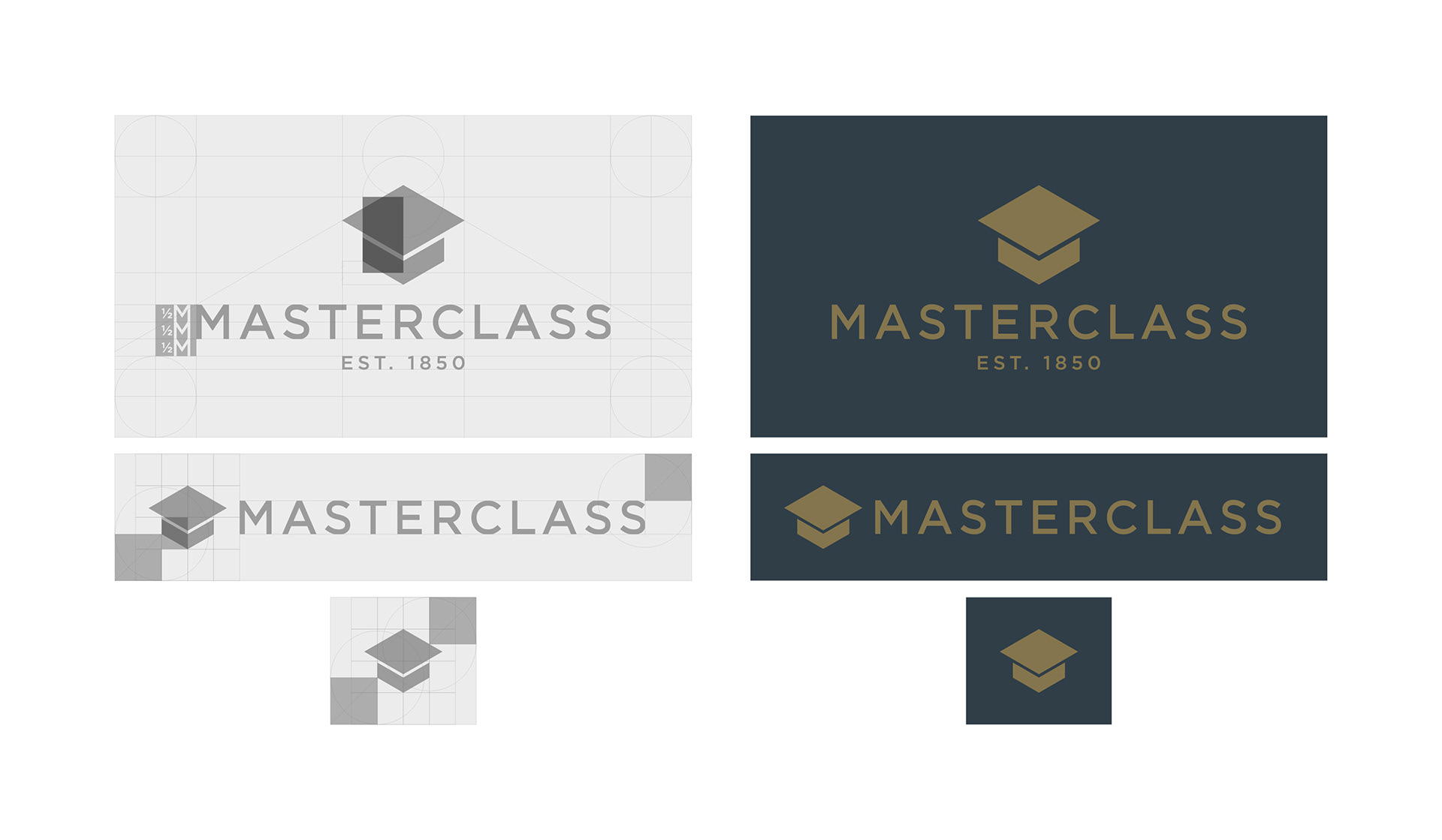
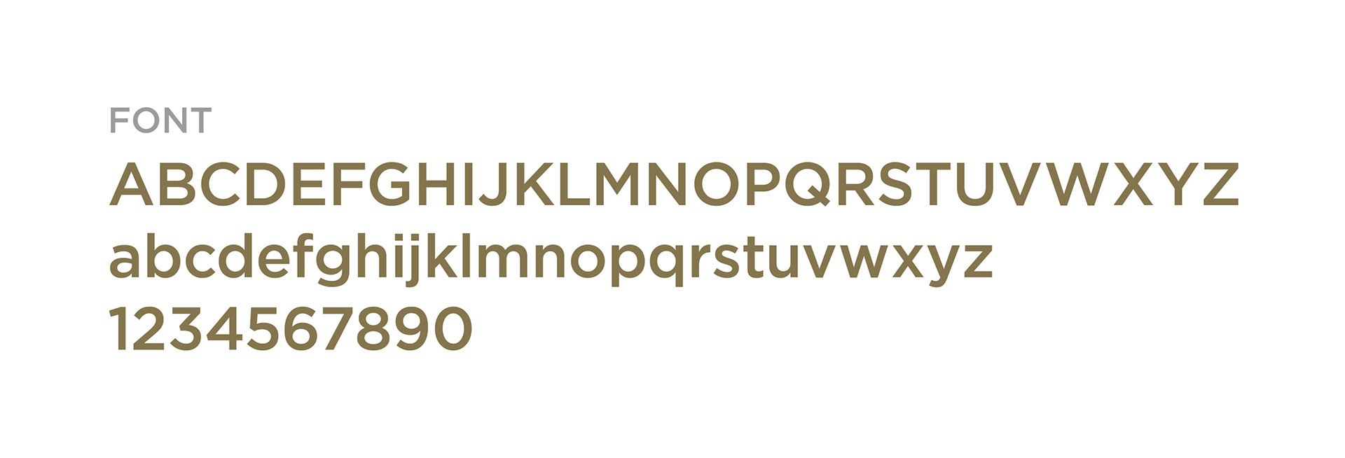
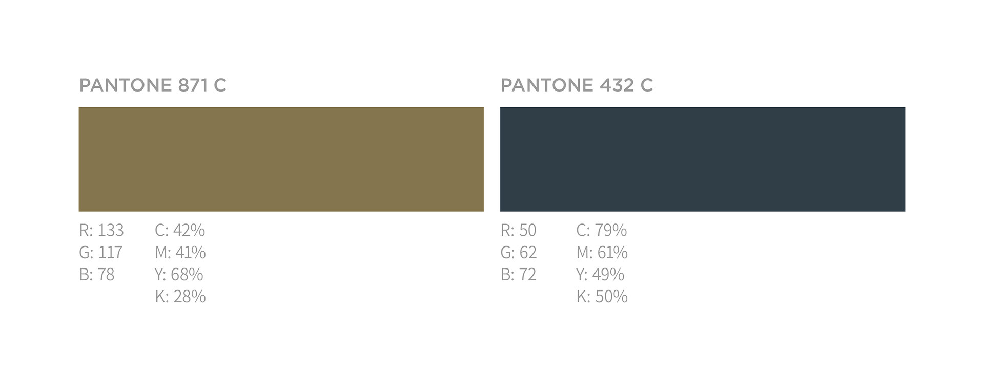
Typography and colour Scheme
The style guide included typography and colours to ensure brand consistency across digital and print assets.
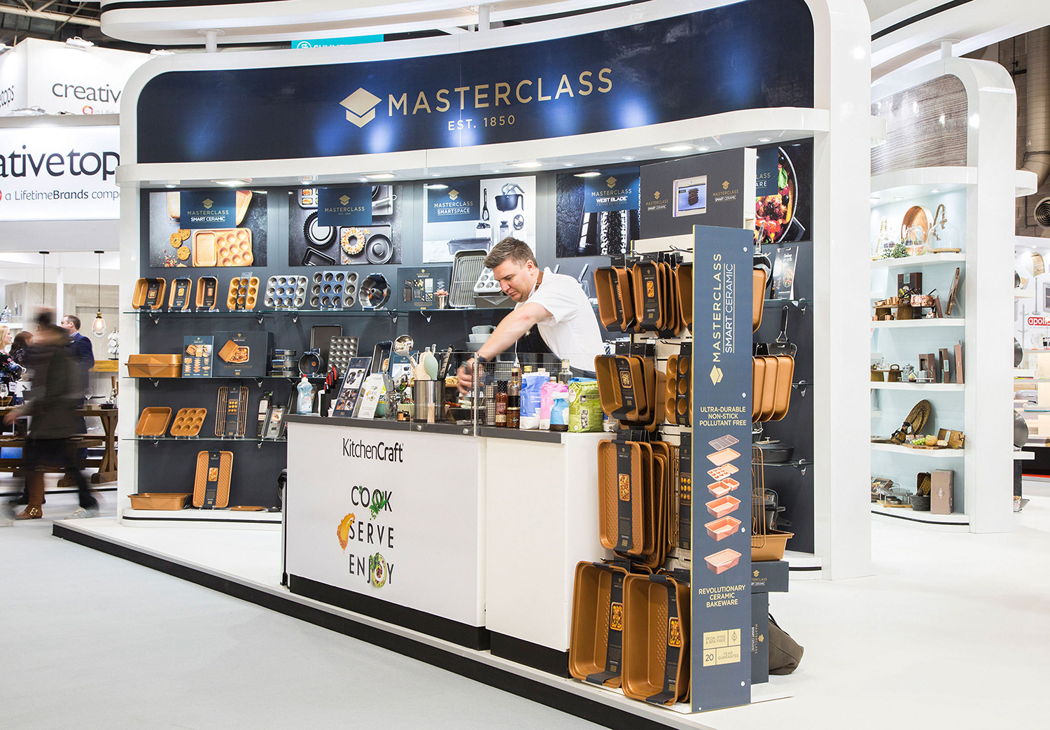
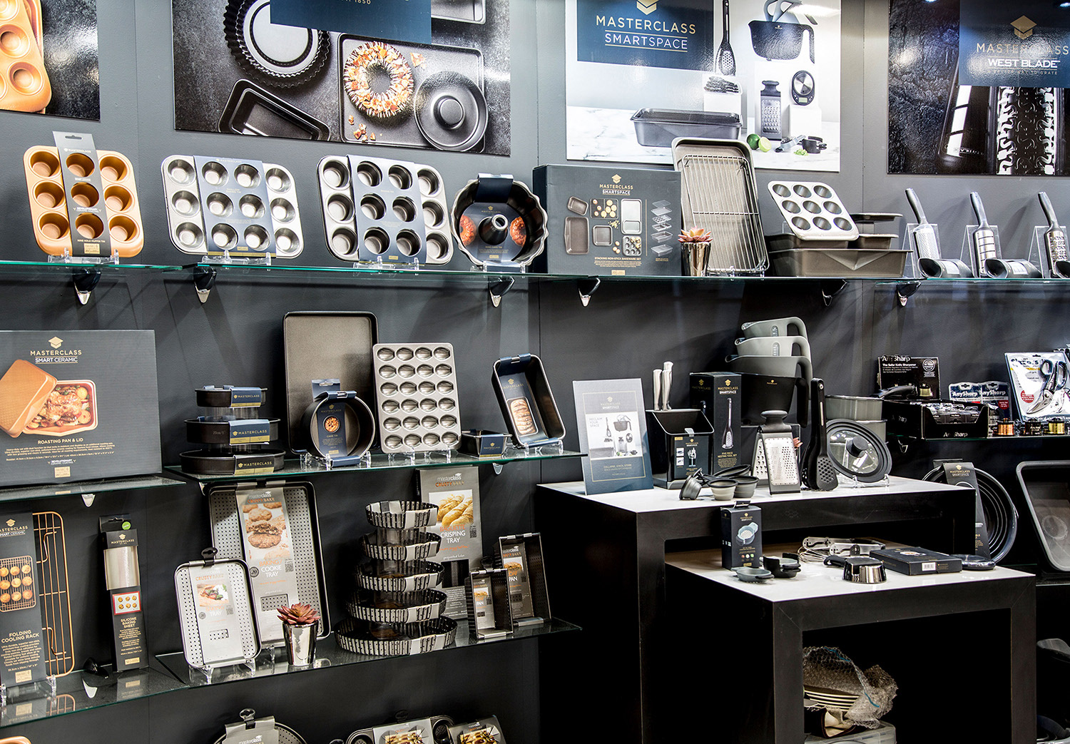
Brand rollout
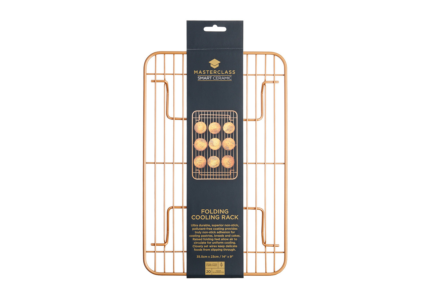
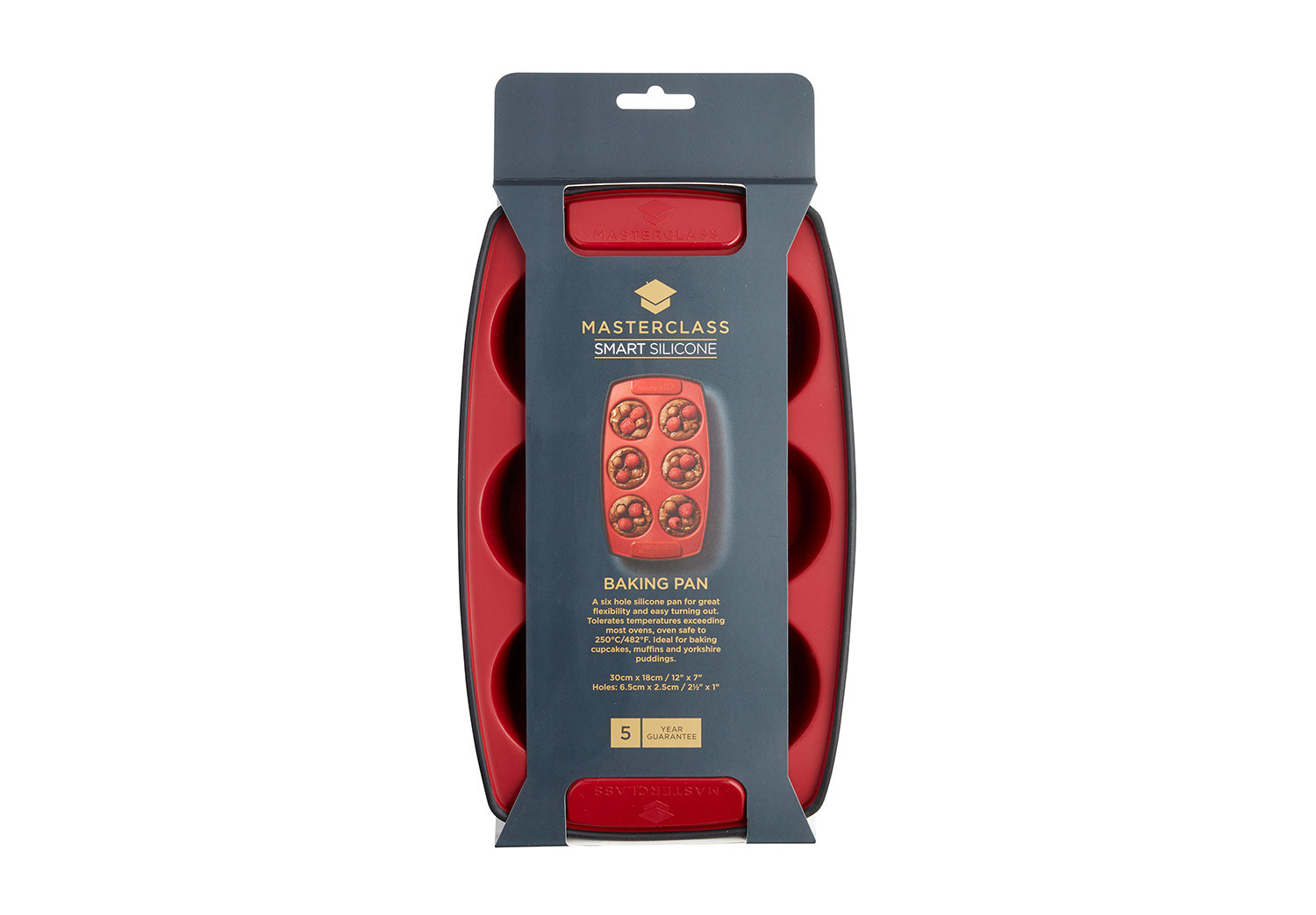
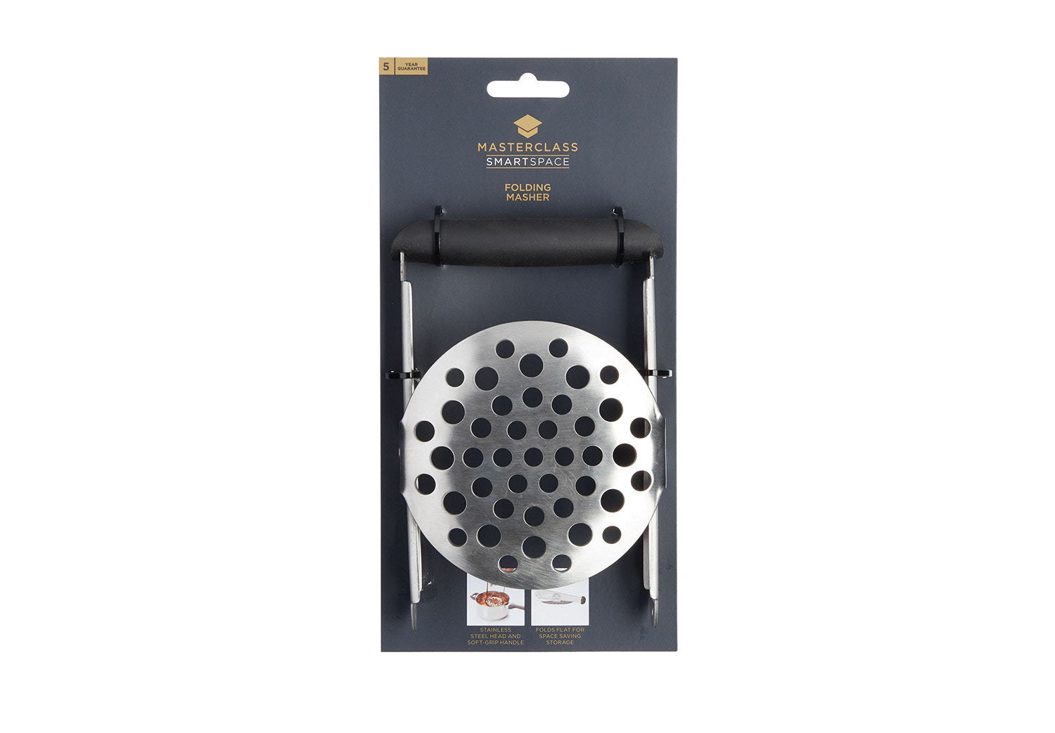
This was a 12 month project which culminated in launching the new brand at our Spring Fair trade show. Finally seeing the finished collection gave me so much pride, especially knowing how much thought was put into each individual piece of artwork.